
We walk through a lot of homes. Some are expensively furnished and unpleasant to live in; others are furnished on very little and you do not want to leave. The difference is almost never money. It is a handful of decisions, taken in the right order.
This guide is for the person furnishing the home they will live in. Not for a sale, not for a tenant — for themselves. The figures in it are conventions from interior practice rather than statistics, and where no reliable measure exists, we say so.
The most expensive mistakes get made in the first week, when the place is empty and impatience is at its highest.
An empty flat tells you nothing about how it will be lived in. You do not yet know where the morning light enters and how far the afternoon light reaches; which corner stays cold; which door swings into which; which route you take twenty times a day. Those things are learned only by living there — a bed, a table, two chairs and three weeks of patience.
The practical rule: buy things in the order you find yourself missing them. If after a month you have not once wanted a console in the hallway, you probably do not need one.
Before furniture, draw the routes. From the front door to the kitchen carrying two bags; from the bed to the bathroom at night; from the sofa to the balcony. Those lines stay clear, and everything else arranges itself around them.
From this comes the most commonly ignored requirement: you have to be able to walk between the furniture. A main route through the home wants around 90 cm; between sofa and coffee table, around 40–45 cm — enough to pass a leg through without stepping over. A piece you have to edge around sideways reads as a mistake every single day, however handsome it is.
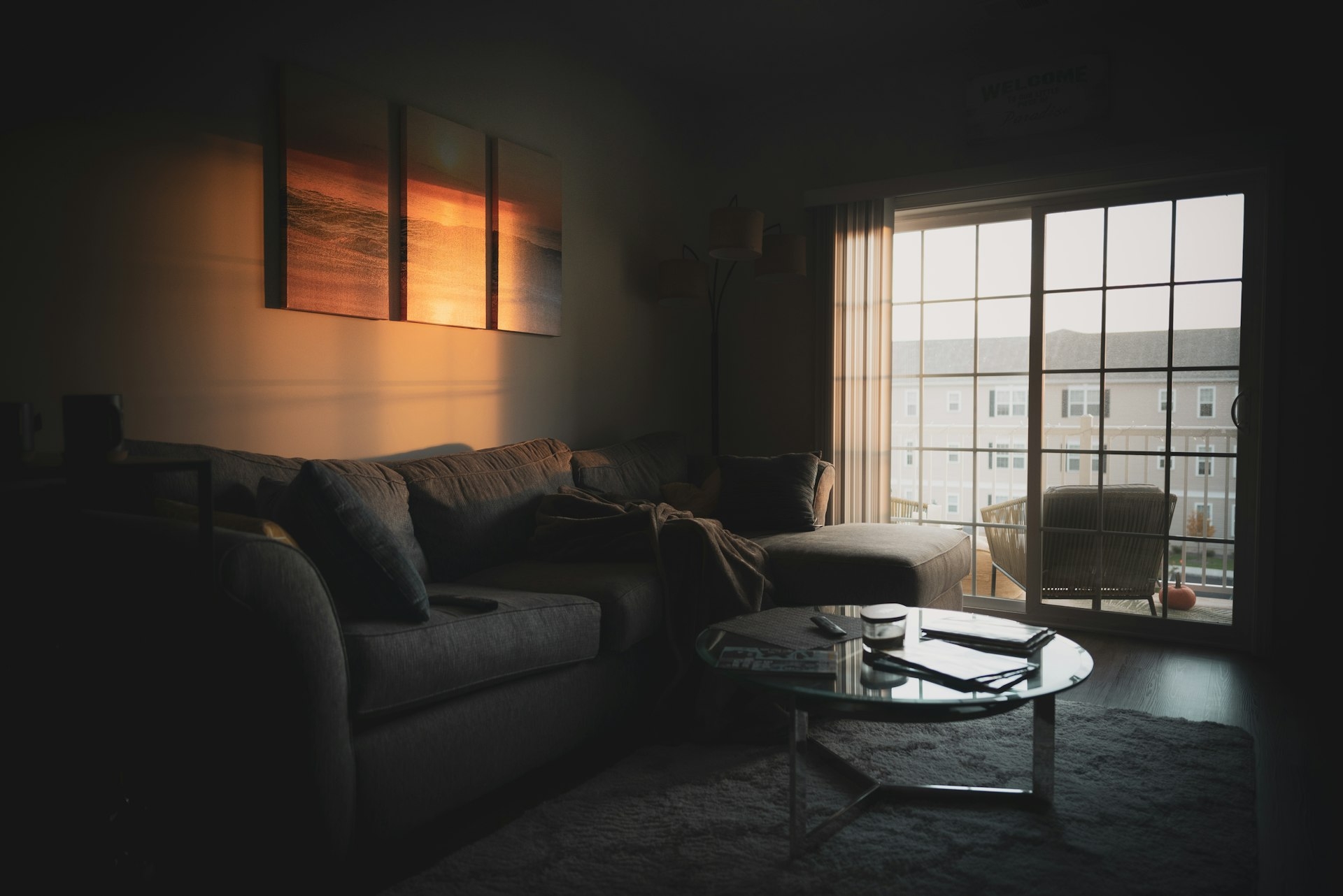
If one thing survives from this piece, let it be this: lighting does more for how a room feels than anything else you can buy for the same money.
A single fitting in the middle of the ceiling lights evenly and kills the room. It flattens everything, erases shadow, and produces the atmosphere of an office. What works instead is layers:
In the evening a living room usually has three or four sources on, none of them the ceiling. That is the difference between a lit room and a pleasant one.
The other half of the decision is the colour of the light itself. For living spaces the convention is 2700–3000 kelvin — warm. Use 2700 K for ambient and accent, 3000 K for task areas that need more clarity. Cool light above 4000 K belongs in offices and garages; in a living room it turns skin grey and wood faintly green.
A small detail with a large effect: fit dimmers wherever you can. The same lamp at 100% and at 30% is two different lamps.
Colour does not exist on its own — it is what the light does to it. So samples get looked at on the wall, in the room, at different times of day, never in the shop and never on a screen.
North-facing rooms turn many popular whites grey-blue and the room goes cold. What works there are whites with a warm base, creams and soft earth tones. South-facing rooms forgive almost anything.
A useful frame if the choice is hard: three colours in roughly 60 / 30 / 10 — dominant (walls and large surfaces), secondary (upholstery, curtains, rug) and accent (cushions, art, small objects). Not a law, just a way of ending up neither bland nor busy.
One practical recommendation: keep ceilings and trim in one tone throughout the home and vary the walls room by room. The rooms get character; the flat still reads as one thing.
If one thing is visible immediately in an inexpertly furnished home, it is that everything is one size smaller than it should be. Small rug, small picture, narrow coffee table, three little objects on a large wall.
The conventions designers work to — these are reference points, not rules:
One large thing almost always beats three small ones. That holds for art, for plants and for furniture.
No arrangement survives if objects have nowhere to go. A cluttered home is usually not a careless one — it simply has too few places.
The ratio that works is mostly closed storage, a little open. Closed absorbs what you do not want to look at; open is for the dozen objects genuinely worth seeing. A wall of open shelving looks good only in a photograph taken immediately after tidying.
Three places most homes waste: the height above doors and in the hallway, under the bed, and the inside faces of cupboard doors.
And the rule that rescues an entrance: everything carried daily needs a home less than an arm's reach from the front door. Keys, post, bag, shoes. Without it, they will live on the kitchen table.
A room can have furniture, paint and lighting and still feel unstarted. What finishes it is the layer on top, and that is almost entirely textile and texture.
Mix surfaces: wood, ceramic, wool, linen, glass, rattan. A room built entirely from smooth, hard finishes sounds hollow — literally, because nothing absorbs sound. A rug, curtains and upholstery make a room not only softer to look at but quieter.
Plants do work furniture cannot: they bring movement and irregularity. And finally, personal objects. A home with nothing personal in it looks like a hotel room, and a hotel room is pleasant precisely because nobody lives in it.
Everything above applies anywhere. Here are a few that come up constantly in the homes we list.
The dark central corridor. Almost no flat of that era is without one. Three things work: light on the walls rather than the ceiling; a mirror positioned to reflect a window or a bright room, not a wall; and a lighter tone than the rooms either side. Not a dark colour "for cosiness" — a corridor is passed through, not inhabited.
The four-square-metre kitchen. This is won vertically: cabinets to the ceiling, rails on the wall, drawers instead of cupboards with doors (you see the whole contents without crouching). Task lighting under the wall units is not a luxury — it is the difference between a workable kitchen and an awkward one.
The glazed balcony. The most underused space in the housing stock here. It was never meant to be storage; it became storage by habit. With a narrow worktop, a chair and some light it becomes the most-used part of the home for nine months of the year. If you are thinking of opening it into the room, that is no longer decorating but alteration: it needs the structure checked and, where common parts or the façade are affected, consents under the condominium rules. We covered the building register and what it shows in a separate guide.
The two-room panel flat. A rectangular living room where everything gets pushed against the walls. The opposite works better — the sofa pulled 10–15 cm off the wall, and a rug holding the seating area together, make the room feel larger rather than smaller. It is the empty centre that shrinks a room.
The old flat with high ceilings. The one case where large furniture and tall curtains pay off dramatically. Here the mistake runs the other way: small pieces under a 3.2 m ceiling look like doll's furniture.
Not a reason to furnish with a sale in mind — the home is for living in. But two decisions are hard to reverse:
Built-in joinery does not come with you and is rarely paid for by the next buyer. The more precisely it was made for one person, the less it is worth to the next.
Strongly personal choices make moving out more expensive. A dark bathroom, an unusual tile, a coloured kitchen — these make the home yours, which is a good reason to do them. It is just worth knowing that undoing them is a renovation, not a coat of paint.
We are not interior designers and do not pretend to be. What we have is having walked through a great many homes — and watched how people react inside them.
So at a viewing we mention things that are not in the listing: where the sun reaches in this flat in January rather than in June; which corridor will stay dark; which wall is load-bearing and which is not; which balcony actually gets used. Those things matter more than a list of dimensions, and none of them show up in a photograph.
If you are still finishing a shell apartment, another budget comes before any of this — we set it out in detail in the guide to the second budget.
Live in the place before you furnish it. Lighting decides more than furniture does — layered, warm, on dimmers. Colour is chosen on the wall, not in the shop. Scale is almost always got wrong in the direction of too small. Storage is the foundation everything else stands on. And the sense of a finished room comes from texture and personal objects, not from one more purchase.
If you are looking at a home and want an honest opinion about what it can and cannot become — call us or come by the office. Walking through it with someone who has seen hundreds of similar layouts saves months of experimenting.
The figures above are established conventions from interior practice and serve as reference points, not standards. Every home has its exceptions.
